
Color Grading
Color Grading allows users to enhance the visual appearance of assets, characters, props, and scene elements by adjusting color and lighting properties.
These controls help create consistent visual styles, improve scene quality, and establish the desired mood for animations.
Purpose of Color Grading
Section titled “Purpose of Color Grading”Color Grading allows users to adjust the overall visual appearance of an entire scene.
Unlike asset-specific property adjustments, Color Grading affects all visible scene elements simultaneously, including:
- Backgrounds
- Characters
- Props
- Images
- Videos
These controls help users create consistent visual styles, improve scene quality, establish mood, and achieve a professional cinematic appearance.
Accessing Color Grading Controls
Section titled “Accessing Color Grading Controls”To use Color Grading:
- Open a scene inside STPro Animator.
- Select the Color Grading panel.
- Adjust the desired color grading settings.
- Preview changes in real time.
All adjustments are applied immediately to the entire scene.
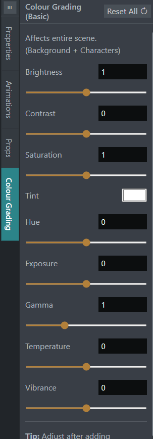
Available Color Grading Controls
Section titled “Available Color Grading Controls”STPro Animator provides the following scene-wide color grading controls:
- Brightness
- Contrast
- Saturation
- Hue
- Tint
- Exposure
- Gamma
- Temperature
- Vibrance
These settings work together to control the overall visual style of the animation.
Tint adds a color overlay effect to the entire scene.
Users can use tint to:
- Create stylized looks
- Add mood effects
- Match branding colors
- Enhance storytelling
Tint is useful when creating themed environments or artistic visual styles.
Exposure
Section titled “Exposure”Exposure controls the overall light intensity of the scene.
Increasing exposure:
- Brightens the scene
- Reveals more detail in dark areas
Reducing exposure:
- Creates darker scenes
- Produces dramatic visual effects
Exposure is commonly used when creating day, evening, or night environments.
Gamma adjusts the balance between shadows and midtones.
Users can:
- Improve visibility in darker areas
- Fine-tune scene lighting
- Create smoother brightness transitions
Gamma adjustments help achieve more natural-looking results.
Temperature
Section titled “Temperature”Temperature controls whether a scene appears warmer or cooler.
Increasing temperature creates:
- Warm tones
- Orange and yellow hues
- Sunset-like environments
Reducing temperature creates:
- Cool tones
- Blue color casts
- Nighttime or winter environments
Temperature is useful for establishing scene mood and atmosphere.
Vibrance
Section titled “Vibrance”Vibrance intelligently adjusts color intensity throughout the scene.
Unlike Saturation, Vibrance focuses on less intense colors while helping preserve natural-looking skin tones and character appearances.
Users can:
- Enhance dull colors
- Improve scene richness
- Create more vibrant visuals
- Maintain balanced color distribution
Vibrance is often used for subtle color enhancement.
Brightness
Section titled “Brightness”Brightness controls the overall lightness of an asset.
Users can:
- Increase brightness
- Reduce brightness
- Match scene lighting
- Highlight important elements
Brightness adjustments help balance scene visibility.
Contrast
Section titled “Contrast”Contrast controls the difference between light and dark areas.
Higher contrast can:
- Increase visual impact
- Make assets appear sharper
- Improve scene clarity
Lower contrast can:
- Create softer visuals
- Produce smoother transitions
- Support subtle visual styles
Saturation
Section titled “Saturation”Saturation controls color intensity.
Users can:
- Increase color vibrancy
- Reduce color intensity
- Create realistic appearances
- Produce stylized visual effects
Examples:
- High saturation creates vivid colors.
- Low saturation creates muted tones.
Hue controls the overall color tone of an asset.
Users can shift colors to create:
- Warm appearances
- Cool appearances
- Creative visual styles
- Consistent scene themes
Hue adjustments are useful when matching multiple assets within a scene.
Note
Color Grading affects the entire scene, including backgrounds, characters, props, images, and videos.
Changes are applied globally rather than to individual assets.
Real-Time Preview
Section titled “Real-Time Preview”All Color Grading adjustments update immediately inside the workspace.
Users can instantly review:
- Color changes
- Lighting modifications
- Transparency effects
- Visual consistency
This allows rapid experimentation without interrupting workflow.
Scene-Wide Visual Consistency
Section titled “Scene-Wide Visual Consistency”Because Color Grading affects the entire scene, it helps maintain a consistent visual style across all assets.
Benefits include:
- Matching character lighting with backgrounds
- Creating unified scene colors
- Improving visual harmony
- Maintaining consistent atmosphere across multiple scenes
Scene-wide grading helps animations look more professional and cohesive.
Create Different Visual Styles
Section titled “Create Different Visual Styles”Color Grading can be used to create different visual moods.
Examples:
Bright and Energetic
Section titled “Bright and Energetic”- Higher brightness
- Higher saturation
- Balanced contrast
Useful for:
- Educational content
- Marketing videos
- Children’s animations
Cinematic
Section titled “Cinematic”- Moderate brightness
- Higher contrast
- Controlled saturation
Useful for:
- Storytelling
- Presentations
- Promotional content
Soft and Calm
Section titled “Soft and Calm”- Reduced contrast
- Lower saturation
- Slight blur effects
Useful for:
- Emotional scenes
- Reflective content
- Relaxed environments
Tip
For the most accurate results, apply Color Grading after adding your background, characters, props, and other scene elements.
This allows you to evaluate how the final scene appears and make adjustments based on the complete composition.
Best Practices
Section titled “Best Practices”For better results:
- Maintain consistent color styles
- Avoid excessive adjustments
- Preview frequently
- Match colors across scene assets
- Use subtle corrections when possible
Balanced grading often produces the most professional results.
Benefits of Color Grading
Section titled “Benefits of Color Grading”Color Grading provides:
- Improved visual quality
- Better scene consistency
- Enhanced storytelling
- Professional appearance
- Flexible creative control
- Faster visual refinement
Summary
Section titled “Summary”Color Grading in STPro Animator allows users to adjust the visual appearance of an entire scene using Brightness, Contrast, Saturation, Hue, Tint, Exposure, Gamma, Temperature, and Vibrance controls. These tools affect backgrounds, characters, props, and other scene elements simultaneously, helping users create consistent visual styles, improve storytelling, and produce professional-quality animations.
Next Step
Section titled “Next Step”Continue to the next documentation section to learn:
- Character library
- Adding characters to scenes
- Built-in character collections
- STPro Actor rendered characters
- Character placement and management
- Working with multiple characters